How the emptiest page on the internet beat the portals
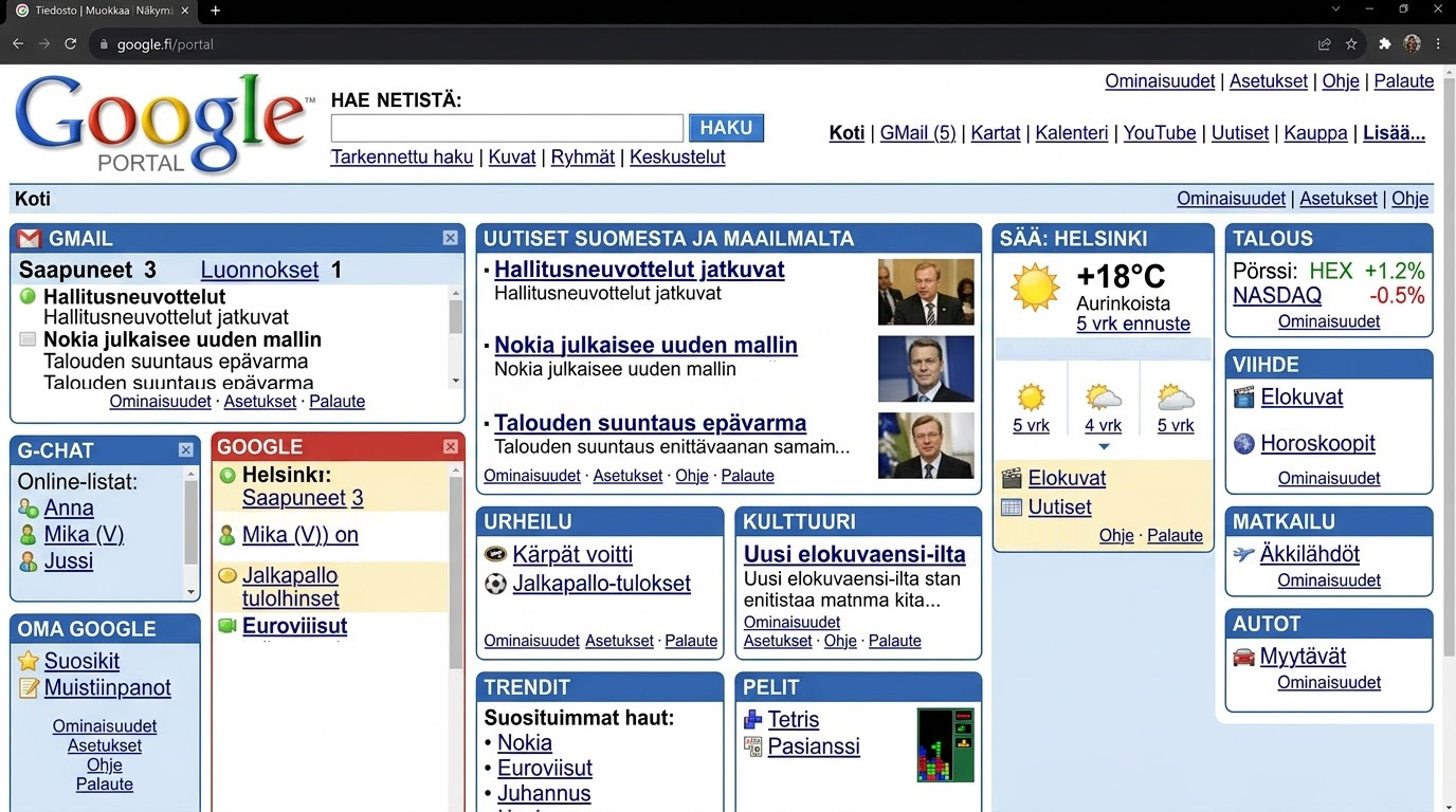
When I started using the internet, AltaVista was my search engine. I remember Yahoo, Lycos and Ask Jeeves too. Their homepages were full of things that seemed useful at the time: news, weather, stock quotes, email, chat, shopping and long lists of categories.
The internet was still unfamiliar, so perhaps putting a map of it on the front page made sense. Portals tried to do that. They gathered as much of the internet as possible into one place and gave everything a label.
People thought Google was still loading
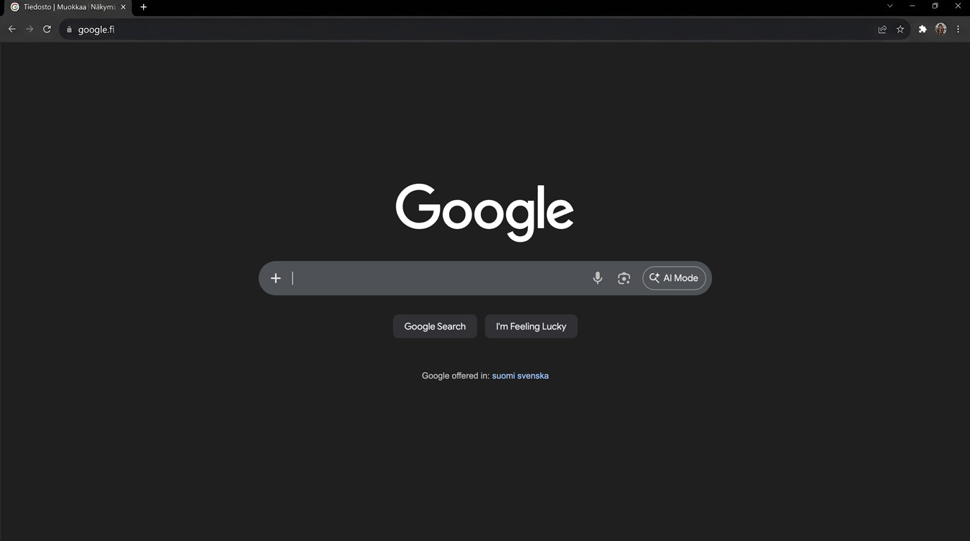
Google looked odd next to them. There was a logo, a search field, two buttons and a great deal of empty space. It is difficult to recreate that impression now, because a sparse search page has become completely ordinary. At the time it could look as if the page had not finished loading.
Google later wrote about an early user test in which this actually happened. The page appeared, but the person testing it did nothing. When asked why, they said they were waiting for the rest of the page.
The story is now usually told as a victory for simple design. The portals were cluttered, Google was clean, and clean won. That version leaves out a fairly important detail: an empty homepage would have been useless if the search results had been poor. Google also worked better.
Google did not need you to stay
The portals were trying to become places where people would spend time. Google assumed that the thing you wanted was probably somewhere else. You entered a search, found a useful result and left.
That changed what the homepage needed to contain. Search did not have to compete with headlines, weather, shopping or the other services the company might want to promote. Google could concentrate on getting people away from Google.
Every item could have been defended
Years later, I worked with Sebastian Greger on the redesign of Nelonen Media's web presence and the first version of its streaming service, Ruutu. Nelonen had several television channels, radio stations, programmes, news and web TV. We could have made a large navigation and defended every item in it. None of the content was imaginary, and all of it belonged to the company.
The navigation ended up with five items.
Where did the rest go?
We had to decide what belonged together, which distinctions meant something to the audience, and which ones mainly reflected the organisation behind the service. Since then the visual design has changed more than once, each time on top of the same five-item logic Sebastian worked out.
A short navigation looks like the easy option. Often it means someone has already dealt with all those entirely valid reasons for adding one more item.
The cluttered portals were well organised
The problem does not disappear when the interface looks restrained. A limited colour palette and plenty of white space make a page more pleasant to look at, but someone still has to decide what appears first. If nobody does, the user ends up working out why they are there and where to go next.
The old portals had a great deal of structure. They grouped and labelled and organised an expanding internet, then placed the result in front of the user. Google made a narrower choice. It did not try to explain the internet before letting people use it.
Looking at those old pages now, Google's homepage does not seem particularly minimal. There is just very little on it competing with the reason you came.