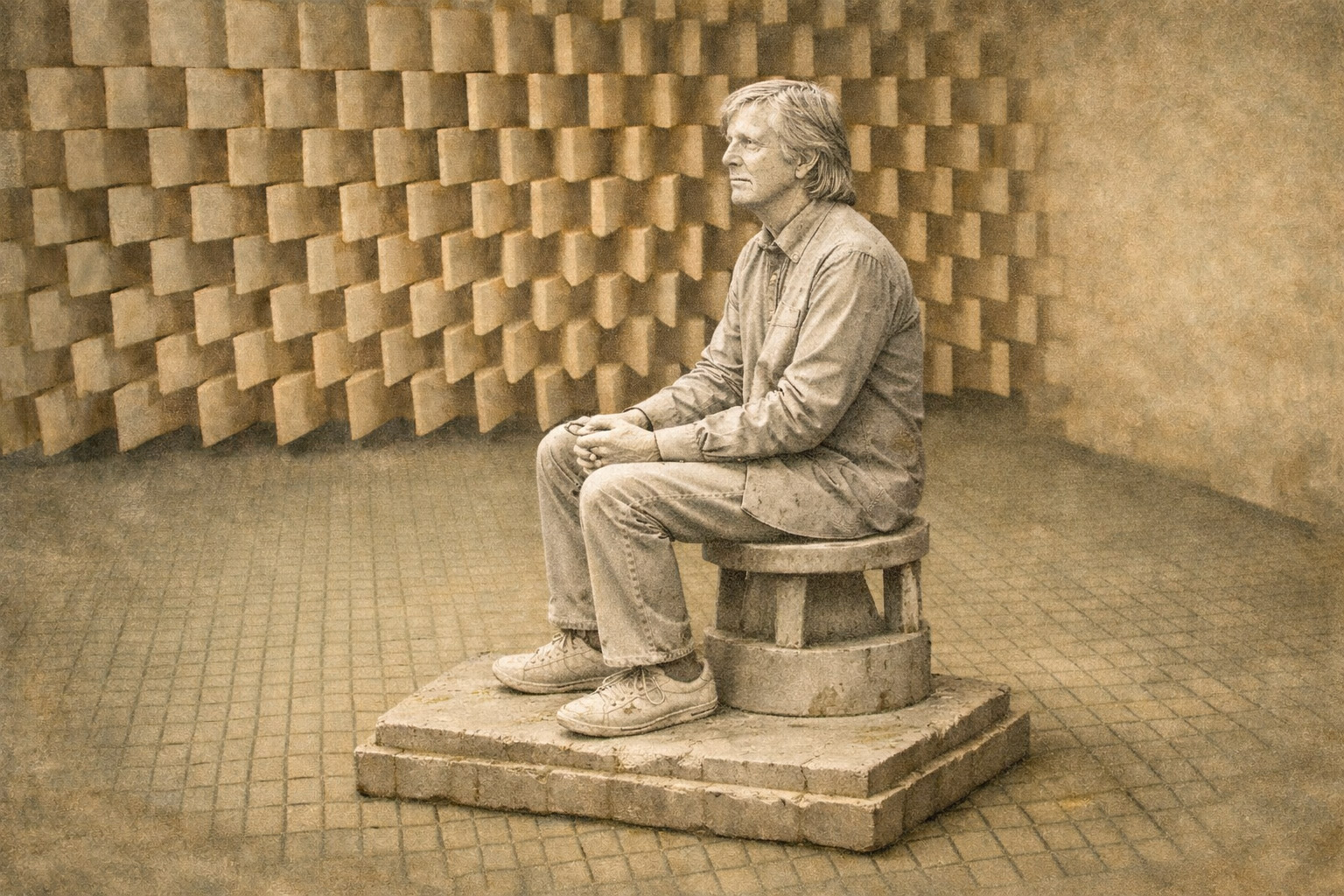
We let the guitar play before we tried to sell it
When we designed the Ruokangas Guitars website, one thing became clear quite early. The customer wasn’t coming there for woodwork. They were coming for music. The guitar mattered, of course, and so did the maple, mahogany and craftsmanship. But the instrument existed because of something the player already carried with them: sound, emotion, obsession, identity. The need to play.
This shaped the first few seconds of the website.
We could have started with specifications, wood choices, prices and workshop language. Instead, the first thing the visitor met was the reason they had arrived:
the sound of a guitar.
A note larger than life. Human emotion. A fire within. 🔥🎸 After that, we could talk about craftsmanship, options and the journey towards the right instrument. We had already shown that we understood why the visitor was there. Selling could wait a few seconds.
Nobody complained. Then the rules changed.
Customers loved the site. Years passed, and nobody complained about the sound. Not once. Then websites were expected to stay silent. 🤫 Sound had become suspicious: an irritation, an intrusion, something a well-behaved website did not do. We were supposed to remove it from pages made for people whose passion was producing more of it.
Defending autoplay sound is not the most fashionable position for a UX designer, I know. Still, applying the rule here felt strange. It still does.
Autoplay deserved its terrible reputation
I understand why autoplay sound became a problem. Bad advertising did a thorough job of ruining it. Random videos started shouting from somewhere below the fold. Popups made noises nobody had asked for. You opened a website on an office laptop and were immediately punished for it. Browsers adapted, designers adapted, and eventually there was a rule:
🔇 Don’t autoplay sound. Fair enough. But the rule grew larger than the situations that had created it, and the context began to disappear. Following a familiar rule may look like good UX, but it does not tell us what matters to this person, on this website, at this particular moment.
Horror films know something websites have forgotten
There is a reason sound changes how something feels so quickly. We react to a tone, a rhythm or a familiar sound before we have finished making sense of the words in front of us. Take the sound away from a film and it immediately loses force. Horror without audio is rarely very frightening. A game without sound can feel deserted even when everything on screen looks exactly as it should.
Imagine Super Mario without the jumps, or The Legend of Zelda without its atmosphere. For that matter, walking into a Guitar Center and not hearing someone attempt Stairway to Heaven within the first minute would feel slightly worrying. When sound disappears, the information can remain perfectly intact while the feeling drains away.
The web has confused silence with clarity
We often design digital environments as if they should be protected from sensation. Nothing should surprise, touch or interrupt. Everything should be smooth, silent and controlled. Life, inconveniently, is not much like that.
We read tone, texture, timing, hesitation and silence. A conversation depends as much on what happens between the words as it does on the words themselves.
So why should the web be emotionally flat? Why should it be permanently protected from music, one of the strongest triggers we have, even when music is the very reason the visitor came?
One guitar note did the work of three paragraphs
This is where I sometimes part company with the way UX is taught. We are given a clean set of answers: remove friction, noise and distraction. Simplify. Mostly, that is useful advice. It also looks reassuringly tidy on a slide. Life rarely fits inside the slide quite so neatly.
Something that looks like friction can carry meaning. Something apparently unnecessary can make an experience memorable. One well-chosen emotional cue can sometimes do the work of three paragraphs.
The guitar note did not make the Ruokangas website less clear. Before the customer had read anything, it told them: these people know why I am here.
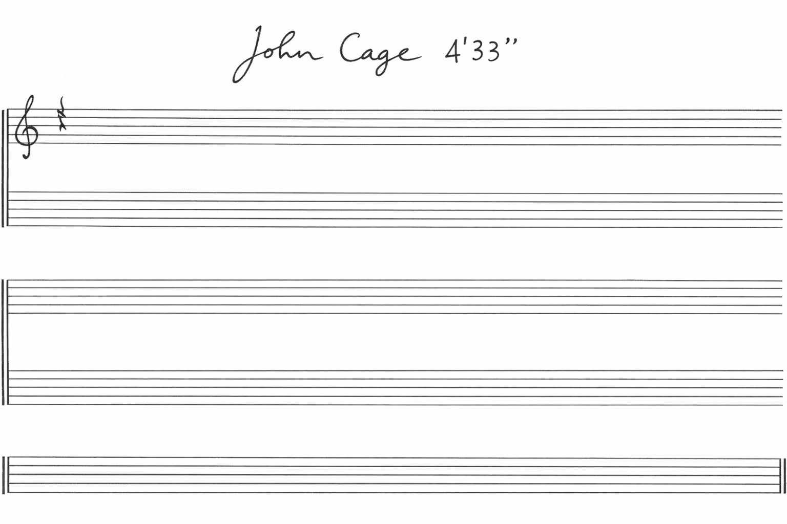
John Cage’s silence was full of noise
John Cage understood this rather well. His piece 4′33″ is often described as four and a half minutes of silence, although it was never really silent. There was coughing, shifting, breathing and waiting. Perhaps some discomfort too. When the expected music did not arrive, people began to notice what was already in the room. 🤧
The same thought is useful on the web. Silence does not automatically create clarity, just as sound does not automatically create distraction. Context decides what either of them means.
On the right website, one guitar note can say more than a paragraph trying very hard to explain itself.
Most websites have not earned the right to make a sound
And that is probably how it should be. Most websites should remain silent. But some experiences lose an essential part of themselves when every sensory layer is removed.
This is not a reason to add sound for the sake of being rebellious. It is a reason to look at the person arriving and ask what they already care about before reading a single word. The answer will not always be sound. Sometimes clarity does mean less. But when it comes to guitar playing, Yngwie Malmsteen has already settled the matter: more is more. 🎸