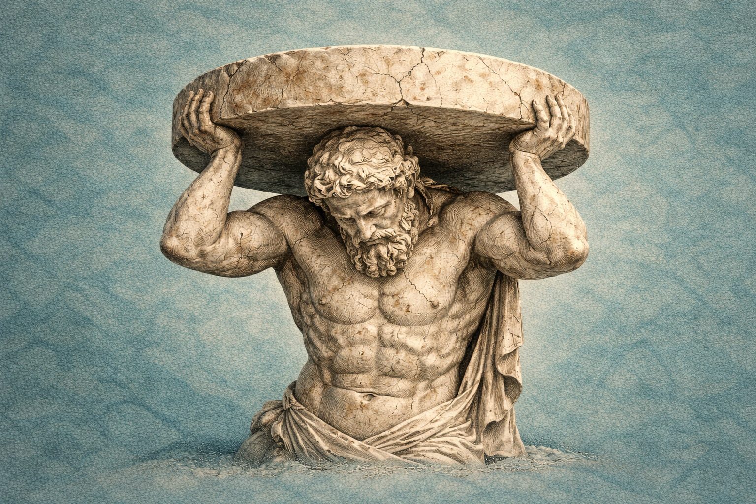
Every sale made the product harder to sell
I was once asked to find out why sales had become sluggish in a startup I was working with.
The company had recently signed an important partner. On the surface, this looked like progress. The salesperson had worked hard to close the deal, the customer had asked for features and we had built them. Everyone could point to the contract and the growing product and say that things were moving in the right direction.
The usage statistics told a less festive story.
The features requested during the negotiations were barely being used. Some had been carried over from systems the customer already knew. Others were things they imagined they might need. They had made sense around a sales table, but once inside the product they mostly sat untouched.
They were not invisible, though. Every user still had to navigate around them.
I had been asked the wrong kind of question
My task was to explain why business was slow and suggest ways to improve it. I could think of improvements within the boundaries I had been given, and some of them might have helped.
The problem was that they would all have worked better without the cognitive load already built into the product.
That answer did not fit the expected shape of the assignment. It pointed back to features promised in celebrated deals. Improving the product properly would have meant questioning decisions that were still being treated as commercial successes.
I found myself between the sales story and the usage data. From one direction I looked like the person spoiling the mood around an excellent contract. From the other, I had been asked to explain what was going wrong and could see the answer in front of me.
It is frustrating to be asked for evidence and then discover that the evidence is outside the permitted frame.
The developers saw the same numbers
Some of the developers were external contractors. They did not have the same need to please the organisation as an in-house team might have had, and they looked at the figures pragmatically. They reached the same conclusion I did.
As far as I could tell, I was the only person particularly interested in this kind of analytics. The sales team was focused on selling. The developers were nerds in the best sense of the word: give them a problem and they wanted to solve it.
Unfortunately, software can turn the ability to solve problems into a reason to keep creating them. A requested feature is interesting to design and satisfying to build. Whether it should remain in front of every user is a different question, and a much less exciting one.
The statistics could show us that the features were not being used. They could not remove them from the contract.
The salesperson saw proof. The user saw decisions.
The software had three sides: individual contributors, people buying their work and larger partners who could distribute or use it at scale. Those larger partners were the ones for whom the service could have produced the clearest practical benefit.
They were also the ones with enough bargaining power to shape the product.
When a salesperson looked at the interface, they could see that everything the partner had requested was there. Each feature was something to demonstrate, name in an offer and use as evidence that the product was substantial. More visible capability meant more things to sell.
A user looking at the same interface saw something else. Every feature asked a question. Does this concern me? Should I understand it? Is this where I am supposed to begin? The answer might be no, but finding that out still took attention.
This is what I mean by a cognitive budget. People do not arrive with unlimited concentration. Every unnecessary choice spends a little of what they have available before they can return to the reason they opened the product.
A simple product can look alarmingly empty in a sales meeting
Good interface design keeps the important things close and moves complexity out of the way until it is needed. To the user, this feels easy. To someone selling software as a collection of capabilities, it can look as though there is not enough product on the screen.
“Look how little there is” requires more nerve as a sales pitch than a long feature list.
This creates a two-edged problem. Features make the product appear more valuable to the buyer during a negotiation. The same features can make it feel less valuable to the people trying to use it afterwards.
The interface is marketing in both situations. It just tells a different story depending on which side of the table you are sitting on.
One more pilot, one more round of features
The partner that had influenced the product so heavily did not end up buying much through it. I suspected that sooner or later they would become tired of software they clearly were not using.
But there was always the possibility of one more deal, framed as another attempt. If usage remained low, it was easy to conclude that some capability must still be missing. The rhythm threatened to repeat itself: another promising agreement, metaphorical champagne, another list of features and another round of coding.
The old features stayed because they had been promised. New ones arrived because they might rescue the relationship. Renewal made the product larger without answering why the existing product was not being used.
The salesperson received the bonus for the deal. The costs appeared later in product development and in the attention required from every user.
The product started wearing an enterprise suit
This became especially damaging when the service was presented to individual customers and new partners.
They encountered a bloated system that looked like enterprise software. Underneath, it could have been a nimble consumer product: something that helped contributors offer their work, helped buyers find what they needed and gave the right partners a useful way to connect the two.
Instead, the interface carried the history of earlier negotiations. New users were being asked to understand decisions made for somebody else.
They did not know any of that history, of course. They only knew how the product felt. If it demanded too much interpretation, they were unlikely to call it impressively feature-rich. They would call it confusing, heavy or difficult to use.
That was the marketing message delivered by the product itself.
Positioning begins after the campaign has finished
Companies can separate marketing, sales and product into different teams. The user never experiences that division.
The promise made in an advertisement travels into the interface. If the campaign says the product is easy and the first screen presents a wall of choices, the user does not stop to consider which department created the contradiction. They conclude that the product is not easy.
That conclusion is positioning. It forms while the person is trying to get something done, with limited attention and no interest in the organisation behind the screen.
This is why clarity is such a powerful form of marketing inside a product. It tells the user that somebody understood the task, decided what mattered and removed the rest from the path. A cluttered interface communicates the opposite: the difficult decisions have been handed back to the user.
The interface markets either clarity or cognitive expense
The salesperson was right about one thing. The interface was marketing the product.
Where we went wrong was treating visible features as the only things it could market. The interface was also marketing how much effort the product required, how confidently it made decisions and whether it understood the people using it.
Our sales view showed that the requested features existed. The analytics showed that people did not need them. Both were facts, but only one described the product in use.
I still wonder what might have happened if we had been able to solve the problems visible in the data instead of the problems easiest to include in the next agreement. The product might have remained lighter, clearer and useful to a much wider group of people. It might even still be widely used.
I cannot know that. What I do know is that every successful deal left something behind in the interface, and every later user had to pay attention to it.