
Easy as 1-23
When I worked at Nokia (external), pretty much all my designer colleagues were Apple users. The iPhone didn't exist yet, but we knew what ease of use meant. Nokia was known for the opposite. Using the phones could be really frustrating, and simple things were hidden who knows where.
Nokia's marketing liked to say "Easy as 1-2-3". I think it was meant to reassure people that this isn't so hard. In reality it was easy as 1-23. When a claim like that misses often enough, it turns into a joke.
Why the marketing books all sound the same, and what it means for your product.
Almost every marketing book I've read tells roughly the same story. One saying goes that nobody buys anything without reading the words first. Another, which I find sharper, says that nobody cares about your solution, only about their problem.
I think the books keep repeating each other because sales psychology and usability rest on the same fundamentals, and those go deep into biology. Anything unclear makes the brain do extra work, and most of the time we're running a bit on autopilot, so we go where there's the least friction. Friction can be used on purpose too, and sometimes it's needed. But the basic point stands. UI usability isn't rocket science. It comes down to what we humans happen to be like.
Over nearly thirty years I've noticed that early-stage product teams usually look for friction in the layout. They debate button placement, font sizes and background contrast. Those are often fine already, or the difference is marginal, but the work feels concrete and doesn't need much engineering. Users keep hesitating anyway. The interface doesn't look broken to them; they just don't understand what it's asking them to do.
WTF? The error appeared after I did what the label said
I've used the same Finnish hosting provider for years. Their visual identity is now on its third iteration. The forms haven't changed.
One field asks for your VAT number. In Finland it's built from your business ID in a way every entrepreneur has had to memorise: drop the hyphen, put FI in front. So you do the conversion, submit, and get an error. The form actually wants the business ID.
It's a very precise example of cognitive load. You used energy converting a number into another format, only to find the work was completely unnecessary, and you feel a bit conned. It isn't a nice way to start a customer relationship, and it hints that there's more of this to come. It's a shame, because I've been their customer long enough to know their customer service is excellent. They really don't need a stain like this in the first minutes of a new customer relationship.
I call this the Cognitive Budget Model. People don't start a session fresh. They have other tabs open and other things on their mind, and every label that needs interpreting takes a little from what's left. If the answer to "is this worth the effort?" doesn't come quickly, they stop.
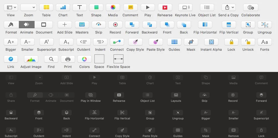
Keynote’s toolbar before and after flat design. As depth, colour and familiar visual cues disappear, the labels have to carry more of the meaning. Without words such as “Mask”, “Lock” or “Copy Style”, several of these icons would be difficult to interpret.
What went missing with the leather textures
When Apple switched to flat design with iOS 7, the leather textures and glossy buttons went away, and many of the cues that showed what was tappable went with them. Screens got cleaner and users had to guess more. Often the only thing left to tell someone what a button did was its label.
A "Read more" link is a small example. By the time someone reaches it, they've already read the intro, and "Read the case study" would tell them what they're about to get. A button labelled "Generate" leaves open what gets generated. An error saying "Something went wrong" doesn't say what to do about it. None of these is a big deal on its own, but a session is full of them.
Nobody knew how to turn off the light
At Nokia I had a phone with a light that kept blinking at night. From the nightstand it lit up the whole room. I asked my manager why it blinked and how to turn it off. He tried to find out, didn't know, and went to ask someone.
It turned out the light meant the display was off. Someone at Nokia had worried that users would think the phone was switched off when the screen was dark, so it needed a blinking light. And since the light was about the display, the setting lived in the display menu. Even the cheaper models had never had this problem, and this was a smartphone meant for advanced users.
It's easy to laugh at. But how would a user who doesn't know that logic ever find the setting?
This one was definitely easy as 1-23.
The words matter a lot here, but this is something only proper user testing would have caught. Maybe the light would never have been needed. If it was, somebody should have had the patience to test every feature, not just the main ones.
What an AI tool can't show you
With products built on language models there's even less to lean on. There are no physical affordances, so users work out what the product can do, and whether to trust it, from the wording alone. A vague onboarding message leaves them asking whether the system can reason, whether it understands context, whether it's making things up and what happens to their data. In my view, how precisely a product describes what it can and can't do matters about as much as the model behind it.
Who wrote that error message?
Design has an owner, and so does engineering. Interface text usually doesn't. It lives somewhere between product, marketing and whoever wrote the last release notes, gets polished at the end and reviewed for tone. The hosting form and the blinking light both look like what happens when nobody is responsible for what the product actually says.
The same goes for the smaller noise: one concept with different names on different pages, vague verbs, promises a notch too confident. Stephen King wrote in On Writing that the road to hell is paved with adverbs, and interface copy is full of them. "Quickly generate insights" says less than "Generate insights". "Seamlessly integrate" doesn't tell me what connects to what.
When founders say they need better UX, they often mean users don't understand what the product does or what will happen when they click. Some of that is layout. In my experience more of it is naming and wording, which is a lot cheaper to fix than a new visual identity. My hosting provider has done three.