
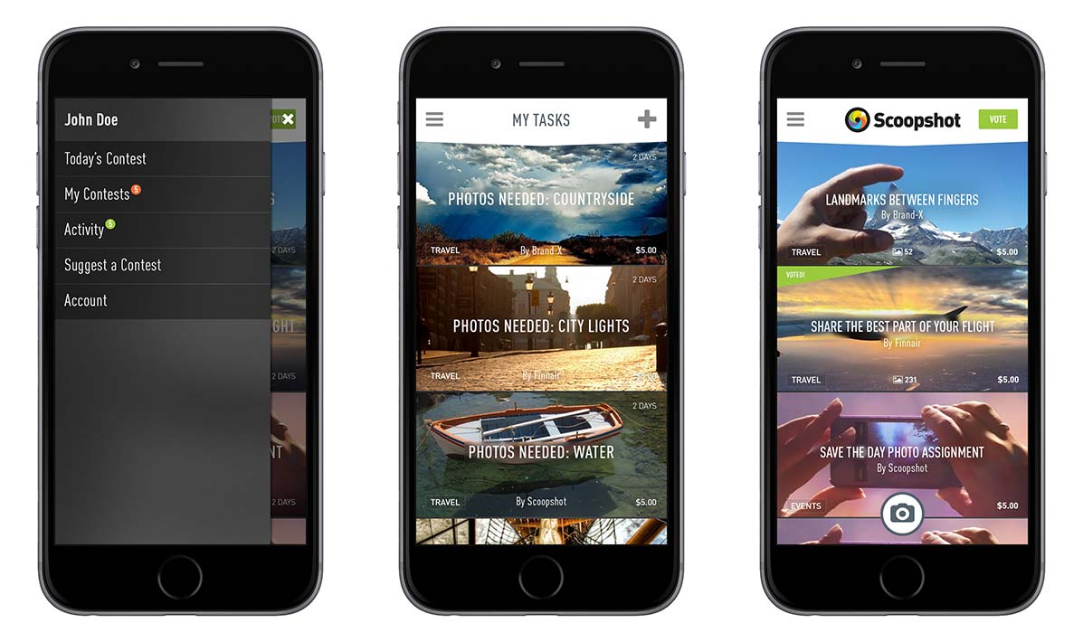
Scoopshot
A mobile service connecting photographers with real-world photo assignments.
Case in preparation
Case studies
Honest work. No highlight reel.
They include wrong decisions, abandoned directions, long projects and work that had to be reconsidered before the result became clear.
01Ruokangas Guitars · Product clarity
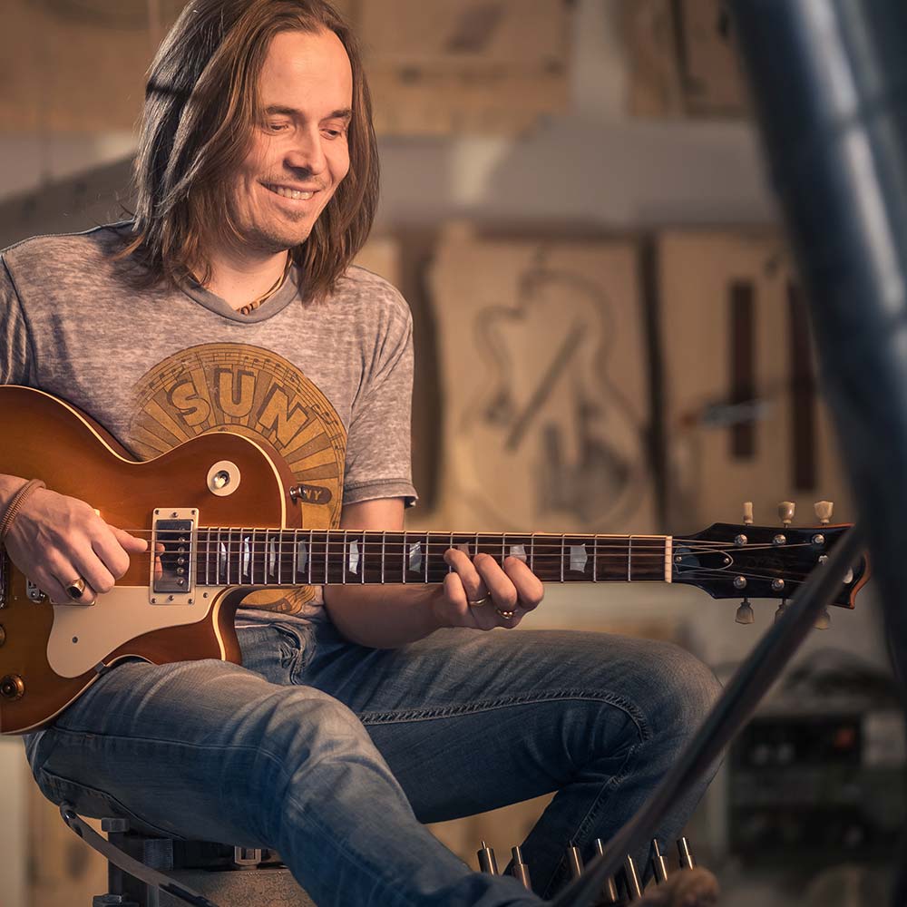
In 2001 Juha Ruokangas was answering customers by email and making mock-ups by hand. The site listed woods, colours and hardware, but not what the finished guitar would look like. The more guitars Ruokangas sold, the more time disappeared into explaining the choices.
We built the first Guitar Builder in Flash. When Flash disappeared, we rebuilt the idea in 3D with Unity, eventually letting customers choose the exact Arctic birch top for their instrument.
By 2026, another problem had caught up with us: the only developer who understood the whole system no longer had time to maintain it.
This time, the way out was AI.
What changed
Most Ruokangas guitars are now ordered through the configurator.
2002
Guitar Builder published in Flash
2010
New WordPress site. The configurator stays in Flash, a risk we knew about
2015
Flash is gone. The 3D rebuild begins in Unity
2023
Guitar Creator runs in the browser with individual flame birch tops
2026
Finished with AI. Browser version live, apps prepared for App Store and Google Play
02Coleaders Community · Brand clarity
A logo I designed too quickly, a client who didn’t want to use it, and what happened when I went back to the step I had skipped.
2024 · First attempt
A new community needed a logo and materials before its first event. I had the idea during the first phone call and reused familiar typography to deliver quickly. When I sent the event badges, the client asked whether the logo could just be text. They were right. It looked finished, but it didn’t represent the community.
2025 · Second attempt
This time I surveyed the members instead of guessing. I asked what Coleaders felt like and why they were there, not which logos they liked. One thought kept returning: growth through connection. A quieter palette, three typefaces and a logo based on Suiseki stones followed from it.
What changed
The question went from “can we leave the logo off the badge?” to “how do we keep the identity intact?”
An in-house team now produces the everyday work. I’m invited back to help keep it coherent.
03TripSay · Product direction
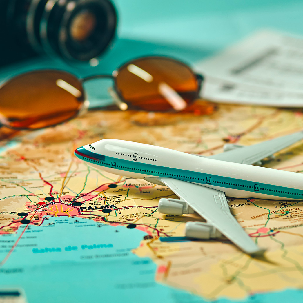
TripSay was an online travel service built by experienced travellers. It had features competitors didn’t, including real-world material from services such as Flickr. Over time, the ideas made it dense. The structure hadn’t caught up with what the founders knew, and using it felt like research.
We rebuilt the experience around the moment a place catches your eye. Instead of starting with information, people could first explore the kind of trip they wanted and compare the details afterwards. After the redesign, the team had a much simpler way to explain what TripSay was and how people should use it.
What happened next
The redesign received three Grand One honourable mentions. Soon afterwards, the iPhone changed how people planned and experienced travel, and the whole category began moving towards mobile.
The case is worth reading for a different reason: it shows what happens when a product contains more knowledge and ideas than its structure can comfortably carry.
04More selected work
A mobile service connecting photographers with real-world photo assignments.
Case in preparation
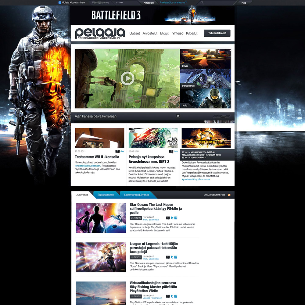
A redesign built around more content, less navigation and a stronger front page for the gaming publication.
Case in preparation
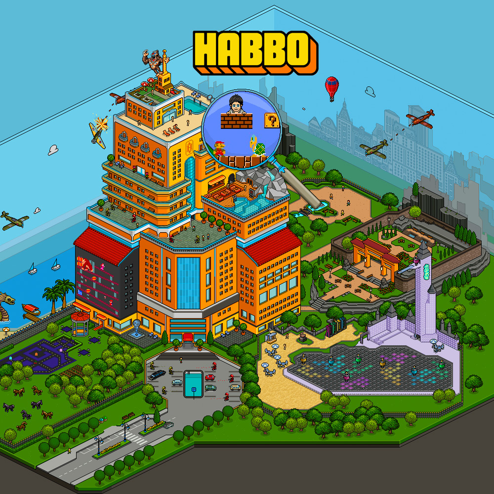
Flash-era campaign experiences for Sulake, including Habbowood II and One Million Habbo.
Case in preparation
Awards
Awards don’t prove excellence. They reveal what it took.
The case studies show the rest.
Ruokangas Guitars
TripSay