

Brand clarity
Coleaders Community
The client asked if we could hide the logo
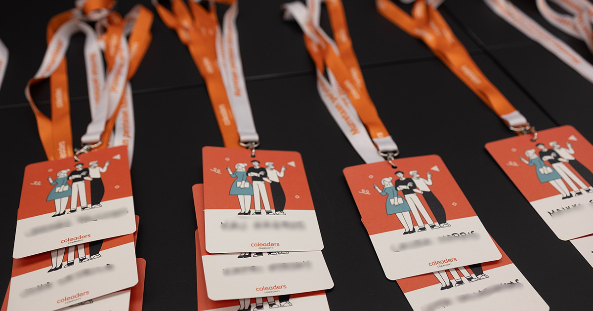
It was a small job. Neck badges for the first Coleaders event.
I sent the designs and got a message back.
“Do we actually need the logo there?”
“Could it just be text?”
I knew what that meant. They were not asking for a smaller logo or another version. They would rather leave it out.
I had made a logo my client did not want to show.
I had designed it during the first phone call
A year earlier, in 2024, the client had called me about a new community. It was already moving and the first event was coming up. They needed a logo and materials quickly.
An idea had formed while we were still on the phone.
I knew the client and understood the business. Or at least I thought I did. I could reuse some familiar typography, adjust the colours and get the work out without making this into a large branding project.
It sounded sensible. Quick for them, efficient for me.
I knew exactly what I had skipped
There had been a small moment during the work when I knew I was moving too fast. I had gone from knowing the client to believing I knew the community.
Those are not the same thing.
I ignored the feeling and finished the job. A marketing agency took the material and what was first called a landing page grew into a full website. The logo was there. The graphics were there. Everything moved forward.
Then came the badges.
I sat looking at the message for a while. This was not one of those cases where a client simply has bad taste and the designer must defend the work. They were right. I had made something that looked finished before I understood what it was meant to represent.
I started thinking about Sami’s soy sauce bottle
For some reason I started thinking about a conversation from early in my career.
I was young, stuck with a design problem and went to see Sami Koskela, one of the most respected designers in Finland.
Sami was a skier from Lapland who had studied in London. His desk was also a sort of small kitchen. It was messy, personal and very much his.
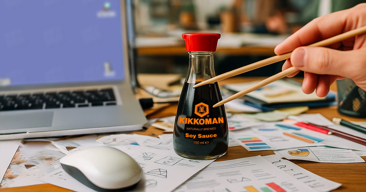
I explained my problem. Sami did not answer. He pointed at a bottle of Kikkoman with his chopsticks.
“Junnu. Make something like that.”
Sami had explained this years earlier
I thought he was joking. He tapped the label.
“Do you know what that is?”
Then he explained it. Kikko means shell. Man means 10,000. The hexagon comes from a turtle shell, and the turtle stands for longevity, stability and prosperity.
The bottle on his desk was suddenly no longer just a bottle with a good-looking mark on it.
Sami looked at me properly this time.
“When the story is right, the logo is strong.”
Brand clarity
The Second Chance
In 2025, the client said something that took me straight back to the badges.
“I don’t want to share our homepage. Something feels off.”
The logo was only part of it. The colours had come from one place, the stock images from another, and my quickly adjusted logo was sitting in the middle. Nothing was obviously broken. It just did not feel like Coleaders.
The homepage gave me the same answer
This time I did not try to rescue the old work. I said we should go back and do the part I had skipped.
I had never asked what the community meant to the people inside it. I had designed an answer before asking the question.
This time I asked the people inside it
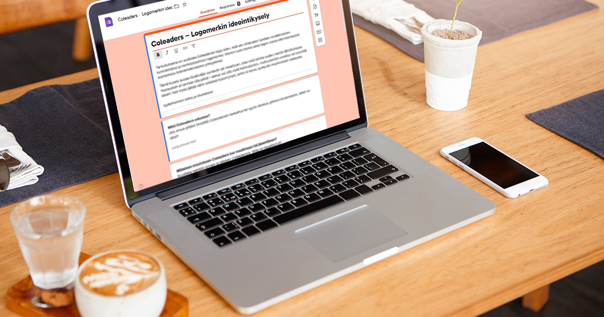
I sent a survey to the community. There were no questions about logos, colours or what kind of brands they liked.
I asked what Coleaders felt like, why they were there and what changed when they became part of it.
They did not describe a company
They described a place to pause, ask questions and move forward with other people. A community without much interest in hierarchy. People could stand on their own and still gain something from being together.
The words were different, but the same thought kept appearing.
Growth through connection.
That was finally something I could design.
The colours stopped shouting
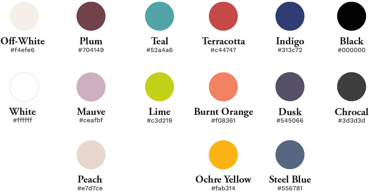
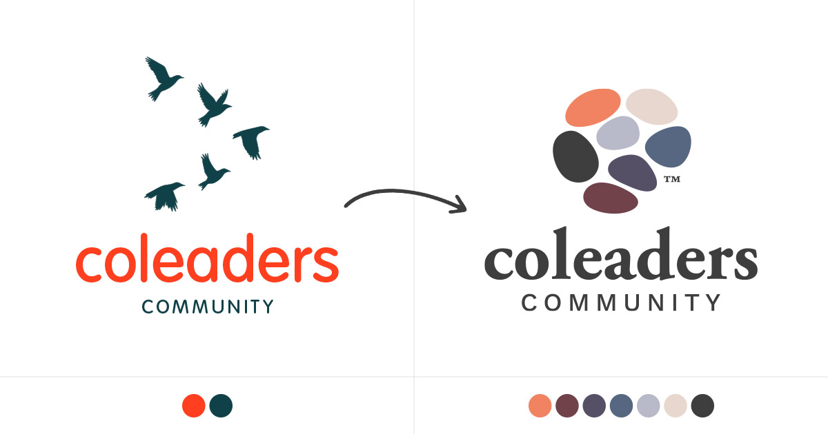
The old identity leaned heavily on a bright orange. It got attention, certainly, but it was doing a lot of the talking.
The new palette became quieter and more layered. The colours could move between backgrounds and sit next to one another without one of them taking over everything.
We kept one thing slightly untidy
The typography had three jobs. Garamond brought some depth. Work Sans handled the practical work. Caveat added a handwritten note when things were allowed to feel less finished and more human.
It was not about finding three fashionable typefaces. They gave the identity room to change its voice without becoming someone else.
The logo began with a stone
I found the idea in Suiseki, the Japanese art of appreciating naturally formed stones.
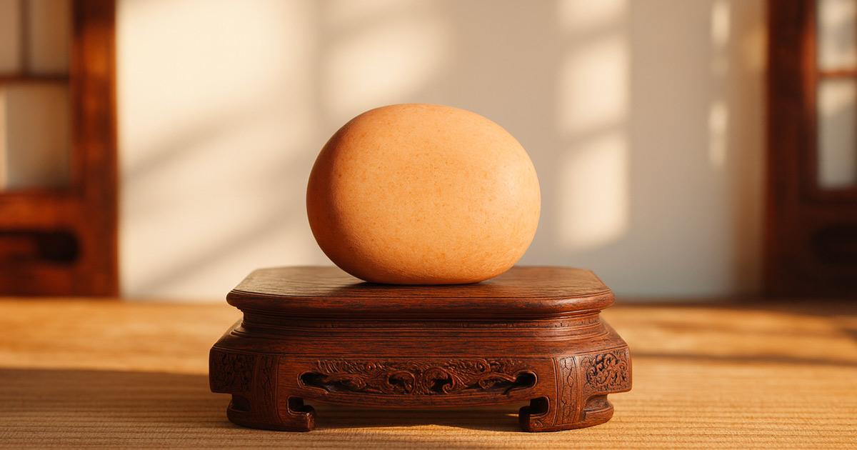
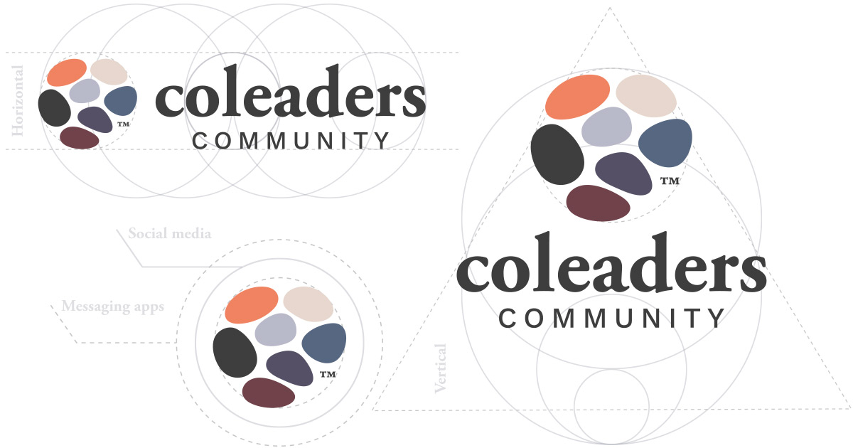
The logo is made of separate shapes with no fixed order. Each one can stand alone. Together they form a group, but there is no leader in the middle and no perfect arrangement they must return to.
This time the idea did not come from a clever shape I happened to like. It came from the way the community had described itself.
Now they ask how to protect the identity
The client is finally proud of the new look.
They now have an in-house team producing the everyday work. I am still invited in now and then to look at a solution with them and help keep the identity coherent.
The question has changed completely.
Before, they asked whether the logo could be left off the badge. Now they ask how to make sure the brand identity stays intact.
For me, that question is the strongest proof that they genuinely love what we made.
Sami, it took me a while
I didn’t understand what you meant at the time. It took years, and one fairly embarrassing logo, before I understood what you meant.
I still think about your desk, the chopsticks and that soy sauce bottle.
I miss you, Sami San.
I wish I could tell you this now.